布局构建教程
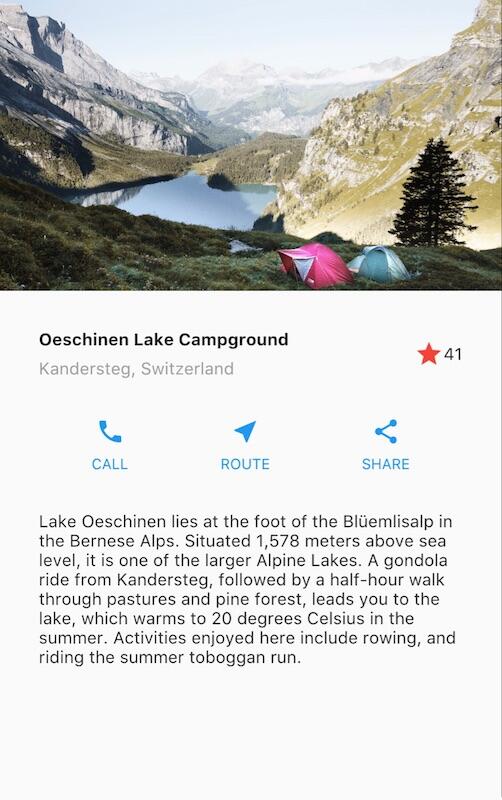
这是一份如何在 Flutter 中构建布局的指南。你将为如下 app 创建布局:
这份指南之前溯源一步解释了 Flutter 中的布局方式,以及展示了如何在屏幕中放置单个 widget。经过了如何水平以及竖直放置 widgets 的讨论之后,一些最常使用的 widgets 都涉及到了。
如果你想对布局机制有个”全局”的理解,可以先从 Flutter 中的布局 开始.
第一步: 创建 app 基础代码
确保你已经 安装和配置 好了你的环境,然后做如下步骤:
-
用下面的代码来替换你的
lib/main.dart文件:lib/main.dart (all)import 'package:flutter/material.dart'; void main() => runApp(const MyApp()); class MyApp extends StatelessWidget { const MyApp({super.key}); @override Widget build(BuildContext context) { return MaterialApp( title: 'Flutter layout demo', home: Scaffold( appBar: AppBar( title: const Text('Flutter layout demo'), ), body: const Center( child: Text('Hello World'), ), ), ); } }
第一步: 对布局进行图形分解
第一步需要将布局分解成它的各个基础元素:
-
识别出它的行和列。
-
这个布局是否包含网格布局?
-
是否有重叠的元素?
-
界面是否需要选项卡?
-
留意需要对齐、内间距、或者边界的区域。
首先,识别出稍大的元素。在这个例子中,四个元素排成一列:一个图像,两个行区域,和一个文本区域。
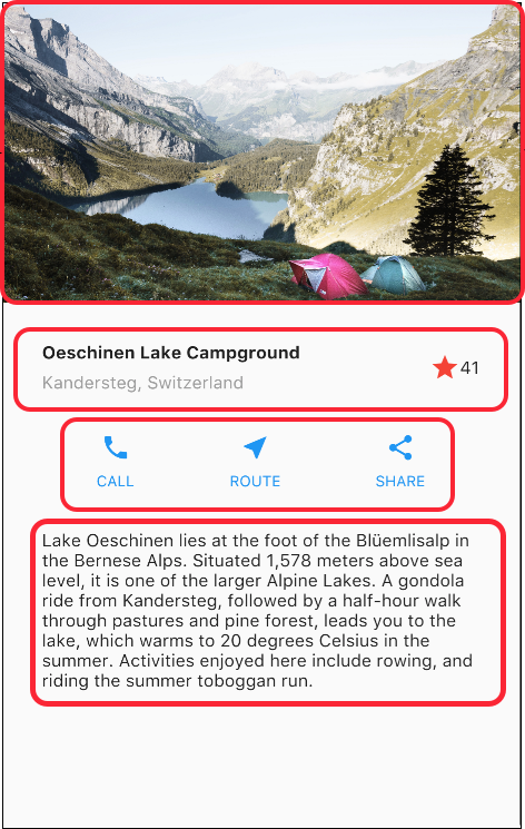
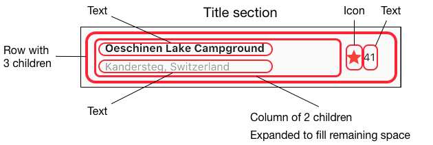
接着,对每一行进行图解。第一行,也就是标题区域,有三个子元素:一个文本列,一个星形图标,和一个数字。它的第一个子元素,文本列,包含两行文本。第一列占据大量空间,因此它应当被封装在一个 Expanded widget 当中。
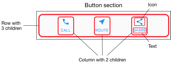
第二行,也就是按钮区域,同样有三个子元素:每个子元素是一个包含图标和文本的列。
一旦图解好布局,采取自下而上的方法来实现它就变得尤为轻松了。为了最大程度减少,深层嵌套的布局代码带来的视觉混乱,需要用一些变量和函数来替代某些实现。
第二步: 实现标题行
首先,你可以构建标题部分左侧列。添加如下代码到 MyApp 类的 build() 方法内顶部。
Widget titleSection = Container(
  padding: const EdgeInsets.all(32),
  child: Row(
    children: [
      Expanded(
        /*1*/
        child: Column(
          crossAxisAlignment: CrossAxisAlignment.start,
          children: [
            /*2*/
            Container(
              padding: const EdgeInsets.only(bottom: 8),
              child: const Text(
                'Oeschinen Lake Campground',
                style: TextStyle(
                  fontWeight: FontWeight.bold,
                ),
              ),
            ),
            Text(
              'Kandersteg, Switzerland',
              style: TextStyle(
                color: Colors.grey[500],
              ),
            ),
          ],
        ),
      ),
      /*3*/
      Icon(
        Icons.star,
        color: Colors.red[500],
      ),
      const Text('41'),
    ],
  ),
);-
将 Column 元素放到 Expanded widget 中可以拉伸该列,以利用该行中所有剩余的闲置空间。设置
crossAxisAlignment属性值为CrossAxisAlignment.start,这会将该列放置在行的起始位置。 -
将第一行文本放入 Container 容器中使得你可以增加内间距。列中的第二个子元素,同样为文本,显示为灰色。
-
标题行中的最后两项是一个红色星形图标,和文字”41”。整行都在一个 Container 容器布局中,而且每条边都有 32 像素的内间距。
如下添加标题部分到 app body 中:
|
@@ -14,11 +48,13 @@
|
|
|
14
48
|
return MaterialApp(
|
|
15
49
|
title: 'Flutter layout demo',
|
|
16
50
|
home: Scaffold(
|
|
17
51
|
appBar: AppBar(
|
|
18
52
|
title: const Text('Flutter layout demo'),
|
|
19
53
|
),
|
|
20
|
-
body:
|
|
21
|
-
|
|
54
|
+
body: Column(
|
|
55
|
+
children: [
|
|
56
|
+
titleSection,
|
|
57
|
+
],
|
|
22
58
|
),
|
|
23
59
|
),
|
|
24
60
|
);
|
第三步: 实现按钮行
按钮区域包含三列使用相同布局-一行文本上面一个图标。此行的各列被等间隙放置,文本和图标被着以初始色。
由于构建每列的代码基本相同,因此可以创建一个名为
buildButtonColumn() 的私有辅助函数,以颜色、图标和文本为入参,返回一个以指定颜色绘制自身
widgets 的一个 column 列对象。
class MyApp extends StatelessWidget {
  const MyApp({super.key});

  @override
  Widget build(BuildContext context) {
    // ···
  }

  Column _buildButtonColumn(Color color, IconData icon, String label) {
    return Column(
      mainAxisSize: MainAxisSize.min,
      mainAxisAlignment: MainAxisAlignment.center,
      children: [
        Icon(icon, color: color),
        Container(
          margin: const EdgeInsets.only(top: 8),
          child: Text(
            label,
            style: TextStyle(
              fontSize: 12,
              fontWeight: FontWeight.w400,
              color: color,
            ),
          ),
        ),
      ],
    );
  }
}
这个函数直接将图标添加到这列里。文本在以一个仅有上间距的 Container 容器中,使得文本与图标分隔开。
通过调用函数并传递针对某列的颜色,Icon 图标和文本,来构建包含这些列的行。然后在行的主轴方向通过使用 MainAxisAlignment.spaceEvenly,将剩余的空间均分到每列各自的前后及中间。只需在 build() 方法中的 titleSection
声明下添加如下代码:
Color color = Theme.of(context).primaryColor;

Widget buttonSection = Row(
  mainAxisAlignment: MainAxisAlignment.spaceEvenly,
  children: [
    _buildButtonColumn(color, Icons.call, 'CALL'),
    _buildButtonColumn(color, Icons.near_me, 'ROUTE'),
    _buildButtonColumn(color, Icons.share, 'SHARE'),
  ],
);
添加按钮部分到 body 属性中去:
|
@@ -48,3 +59,3 @@
|
|
|
48
59
|
return MaterialApp(
|
|
49
60
|
title: 'Flutter layout demo',
|
|
50
61
|
home: Scaffold(
|
|
@@ -54,8 +65,9 @@
|
|
|
54
65
|
body: Column(
|
|
55
66
|
children: [
|
|
56
67
|
titleSection,
|
|
68
|
+
buttonSection,
|
|
57
69
|
],
|
|
58
70
|
),
|
|
59
71
|
),
|
|
60
72
|
);
|
|
61
73
|
}
|
第四步: 实现文本区域
将文本区域定义为一个变量,将文本放置到一个 Container 容器中,然后为每条边添加内边距。只需在 buttonSection 声明下添加如下代码:
Widget textSection = const Padding(
  padding: EdgeInsets.all(32),
  child: Text(
    'Lake Oeschinen lies at the foot of the Blüemlisalp in the Bernese '
    'Alps. Situated 1,578 meters above sea level, it is one of the '
    'larger Alpine Lakes. A gondola ride from Kandersteg, followed by a '
    'half-hour walk through pastures and pine forest, leads you to the '
    'lake, which warms to 20 degrees Celsius in the summer. Activities '
    'enjoyed here include rowing, and riding the summer toboggan run.',
    softWrap: true,
  ),
);
通过设置 softwrap 为 true,文本将在填充满列宽后在单词边界处自动换行。
添加文本部分到 body 属性:
|
@@ -59,3 +72,3 @@
|
|
|
59
72
|
return MaterialApp(
|
|
60
73
|
title: 'Flutter layout demo',
|
|
61
74
|
home: Scaffold(
|
|
@@ -66,6 +79,7 @@
|
|
|
66
79
|
children: [
|
|
67
80
|
titleSection,
|
|
68
81
|
buttonSection,
|
|
82
|
+
textSection,
|
|
69
83
|
],
|
|
70
84
|
),
|
|
71
85
|
),
|
第五步: 实现图片区域
四个列元素中的三个已经完成了,只剩下图片部分了。如下添加图片文件到示例工程中:
- Create an
imagesdirectory at the top of the project. -
添加
lake.jpg
-
更新
pubspec.yaml文件,添加一个assets标签。这使得在你的代码中可以访问到该图片。{step4 → step5}/pubspec.yaml@@ -18,3 +18,5 @@1818flutter:1919uses-material-design: true20+ assets:21+ - images/lake.jpg
现在你可以在你的代码中引用该图片了:
|
@@ -77,6 +77,12 @@
|
|
|
77
77
|
),
|
|
78
78
|
body: Column(
|
|
79
79
|
children: [
|
|
80
|
+
Image.asset(
|
|
81
|
+
'images/lake.jpg',
|
|
82
|
+
width: 600,
|
|
83
|
+
height: 240,
|
|
84
|
+
fit: BoxFit.cover,
|
|
85
|
+
),
|
|
80
86
|
titleSection,
|
|
81
87
|
buttonSection,
|
|
82
88
|
textSection,
|
BoxFit.cover 告诉系统图片应当尽可能等比缩小到刚好能够覆盖住整个渲染 box。
第六步: 最终的收尾
在最后的步骤中,需要在一个 ListView 中排列好所有的元素,而不是在一个 Column 中,因为当 app 运行在某个小设备上时,ListView 支持 app body 的滚动。
|
@@ -72,13 +77,13 @@
|
|
|
72
77
|
return MaterialApp(
|
|
73
78
|
title: 'Flutter layout demo',
|
|
74
79
|
home: Scaffold(
|
|
75
80
|
appBar: AppBar(
|
|
76
81
|
title: const Text('Flutter layout demo'),
|
|
77
82
|
),
|
|
78
|
-
body:
|
|
83
|
+
body: ListView(
|
|
79
84
|
children: [
|
|
80
85
|
Image.asset(
|
|
81
86
|
'images/lake.jpg',
|
|
82
87
|
width: 600,
|
|
83
88
|
height: 240,
|
|
84
89
|
fit: BoxFit.cover,
|
Dart code: main.dart
Image: images
Pubspec: pubspec.yaml
大功告成!当你热加载 app 时,你应当可以看到和本页开头截图一样的 app 布局了。
你可以参考文档 为你的 Flutter 应用加入交互体验 来给这个布局增加交互。